In this blog I have found a range of interesting packaging solutions will have to figure out the nets that go with them. Just tying to get an idea of relevant forms of packaging so my outcome don't just become boring boxes.
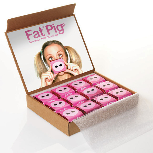
I really like how every individual chocolate had its own packaging this shows that sweets and chocolates are not only packaged to be contained but the wrappers can also be a form of packaging.
Think the stock is great in the above and the form the packaging takes makes the product more visually appealing.
minimalist but effective a simple belly bind can work just as well as a huge box. A thought worth considering.
I bet the choclates would taste just as well in a bag but theres something special about getting them in your own little box. Gives them a touch of class.
I might actually make my own gift box, what I love about these ones is how the packaging has been skilfully manipulated to communicate its content.
Just a nice range simple in its execution.
The above and below might not be achievable considering my subject however stuff like this makes you aware of the design possibilities.
Assortment of tins is a possibility sweets in a tin very vintage.
Its the layers of packaging here makes you realty feel like your getting something special not just cheese.
Another packaging solution the tray of sweets could slide out?
Fantastic packaging that communicates on many levels to great effect.
Effective branding nice simple idea.
Cheap materials given a new lease of life love the belly band could use this to keep something sealed like the above or just as a decoration.
Looking at this because other materials can be used simply to enhance the packaging and give it a special feel.
Great example of how packaging can be developed over a range.
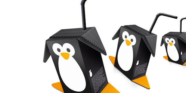
I am really liking the idea of simple striking illustration its not too in the face and it does the same job. I might apply these simple methods to my own practice.
Reminded me of my idea branded by a name. Looking at this gives me more direction I particularly like the shape of the black and white branding.
The colours are so vibrant the boxes would be nice on there own but this is jet again more food for thought on how to bring a range together the final layer of packaging opens up the possibility of selling many products and flavours together without having to buy them separately. This final layer of packaging is also a great visual communicator.
It always gives the product a lift when the packaging opens like a wedding ring, you could make a piece of dog shit more appealing if you presented it in this box.
Three products in one another great gift pack this could work well with sweets.
love the candy stripes this Love must be put into my ideas somewhere because it works so well.


No comments:
Post a Comment