
In the exercise below we were taught to identify these gaps and kern letters properly.

Using the Ariel we kerned the word RAILWAY. Kerning the space in between the A, I and L made up for the visual breaks between L and W.
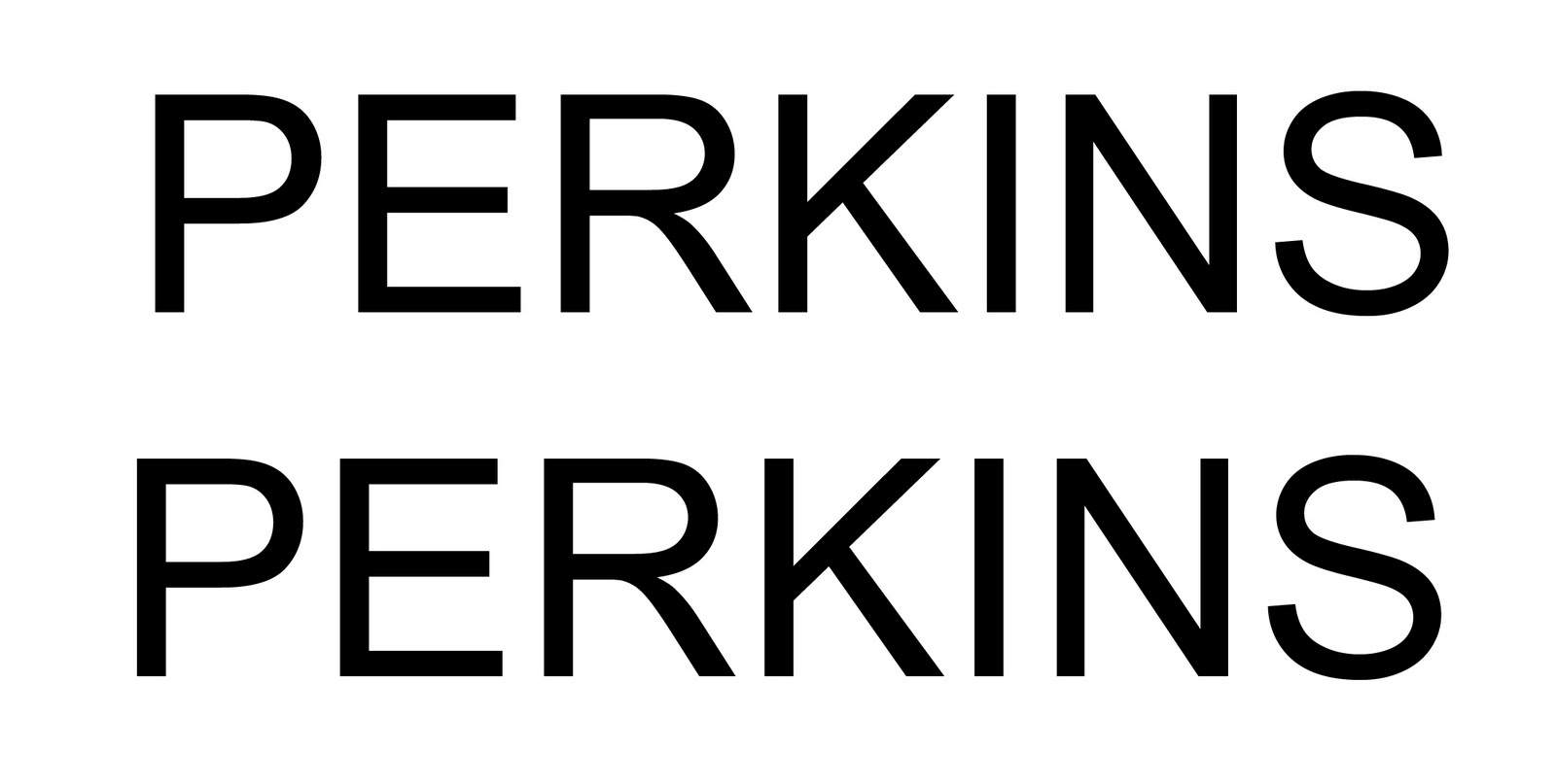
Applying the first techniques we had a go at kerning our own names.

The next test was an experiment with hierarchy, weight and size to try and make the reader see the chosen word first. In the order of one, two, three, four.

The next test, using only one case, was to make the eye read from the centre of the page to the bottom back to the top.

The net challenge a little more tricky was to make the four the biggest word on the page, but have the eye still read the numbers one, two, three, four.

Next a more adventurous approach In what other ways could I dictate the order in which the eye read numbers.
The next challenge was working with a sentence and how this is read.
My sentence was: You can't polish a turd.
If split correctly: You can't
Polish a turd.
How the word is said !
No comments:
Post a Comment