In the final type session we learned how to effectively apply an image to type. Firstly below we were asked to arrange an image on 2 column grid. Our task was to make the viewer read the article as well as draw leading the eye by applying all we had learned in the previous three sessions.
Working with collumns I made 2 variations.
Our next task was to arrange our image around three columns. below....
Showing posts with label Typography workshop.. Show all posts
Monday, 25 October 2010
Wednesday, 20 October 2010
Typography Workshop 2
In the workshop we were taught about kerning experimenting how we could manipulate type by decreasing the visual space between character. If letters are spaced to similar, this creates uncomfortable space in between letter forms disrupting the flow of the text.
In the exercise below we were taught to identify these gaps and kern letters properly.
Using the Ariel we kerned the word RAILWAY. Kerning the space in between the A, I and L made up for the visual breaks between L and W.
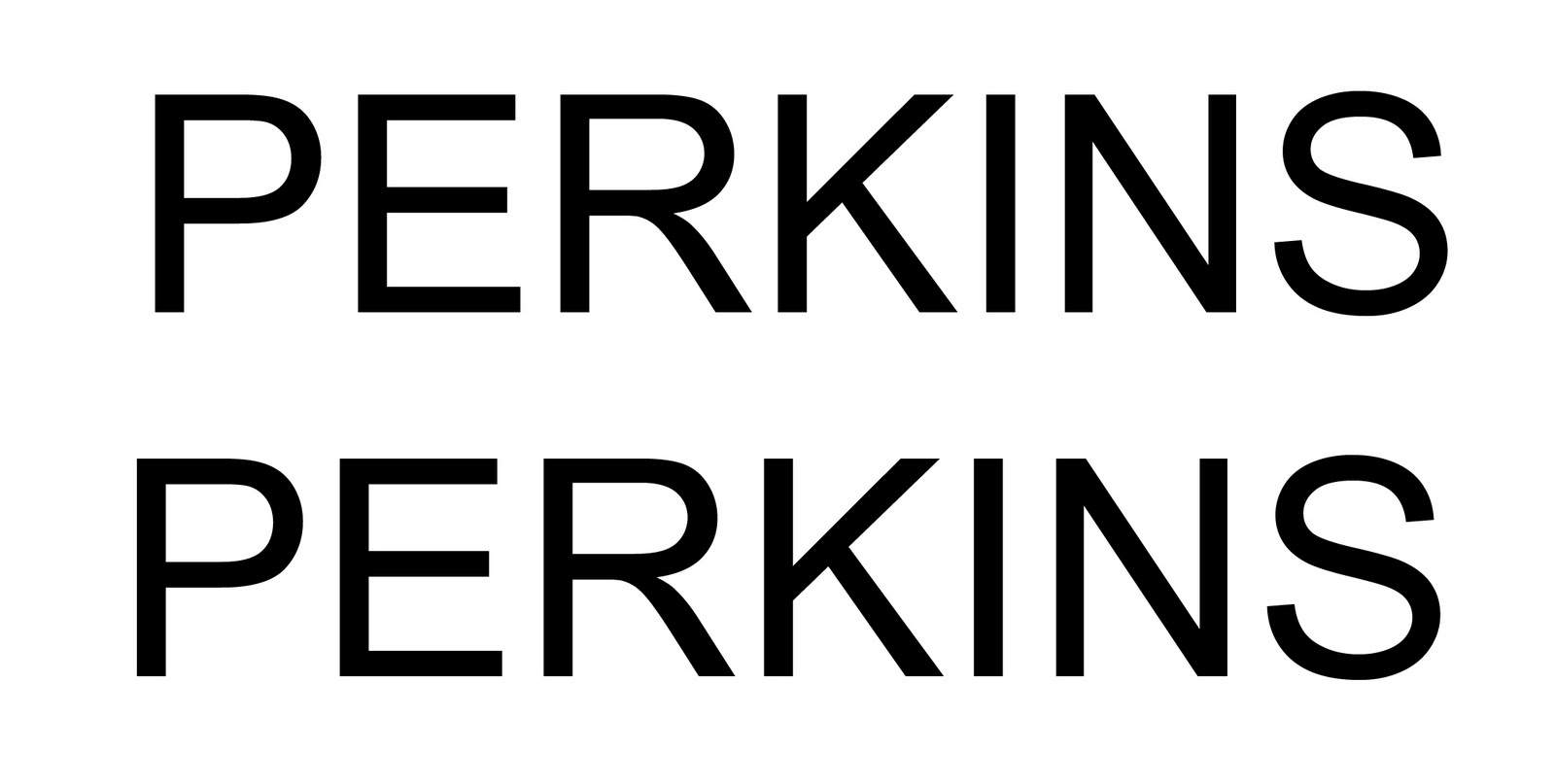
Applying the first techniques we had a go at kerning our own names.
The next test was an experiment with hierarchy, weight and size to try and make the reader see the chosen word first. In the order of one, two, three, four.
The next test, using only one case, was to make the eye read from the centre of the page to the bottom back to the top.
The net challenge a little more tricky was to make the four the biggest word on the page, but have the eye still read the numbers one, two, three, four.
Next a more adventurous approach In what other ways could I dictate the order in which the eye read numbers.
The next challenge was working with a sentence and how this is read.
My sentence was: You can't polish a turd.
If split correctly: You can't
Polish a turd.
How the word is said !
The next test, using only one case, was to make the eye read from the centre of the page to the bottom back to the top.
The net challenge a little more tricky was to make the four the biggest word on the page, but have the eye still read the numbers one, two, three, four.
Next a more adventurous approach In what other ways could I dictate the order in which the eye read numbers.
The next challenge was working with a sentence and how this is read.
My sentence was: You can't polish a turd.
If split correctly: You can't
Polish a turd.
How the word is said !
What is design for print. Typography Workshop 3
The first task of the workshop was to communicate our chosen proverb to guide the eye around the page. To do this we had to be carefully consider the weight of the text, placement, point size, case size and hierarchy.
The next exercise was to analyse the above poster based on the same principles we had used in the previous exercise.
We had to recognise were the eye was being directed and why. For me the eye is directed firstly to Less Kellett, this is the first and most important piece of information that the designer want his audience to see first. The fighters name in this case carries the event. This is done by the order of the text and a simple use of colour.
In my opinion the eye is guided around the page in the below order.
1. Less Kellett
2. Klondike Jake
3.Wrestling
4. Victoria hall
5. Bobby Ryan
6. Alan Denielson
All other information follows.
What I find unusual about this poster is that an important piece of information is overlooked the date. This to me is of equal importance to the location yet the dominance of its red frame distracts the eye from this. I suppose this demonstrates the power of colour in design.
In this next exercise we experimented with a body of text. We had to fit this text into the columns by increasing the leading. After this we had to distiquish which was most readable for a leaflet format. It was agreed that 10pt on 14 leading ( second from the left ) was easiest to read once printed.
The last exercise was to make type fit exactly into the columns but by not increasing the point size as seen in column 2, just taking away all the breaks in the text. ( seen in col 3 )
Monday, 18 October 2010
Typography Workshop 1
I went into the 1st type session not expecting much my mind was made up I was going to do image, but now i'm not sure. In the session we talked about how the formation of type effects us in different ways and that understanding type was not as difficult as we thought. I found a lot of the rules I already knew all it took was someone someone to point them out. Firstly we covered how upper and lowercase effects us differently and that type is simply speech.
The real talent is knowing how to use this voice depending on what its is we are trying to say. In the exercise below we practiced how we can use our voice effectively.
Using the word dog we were told to firstly make a friendly dog by selecting an appropriate typography and changing its weight and hierarchy to mirror the word. I used Helvetica in lowercase, I feel this is less threatening as we view higher case with impact danger i,e headlines.
We were then told to type a guard dog, in contrast to the friendly dog I chose a bold type Impact and made my dog massive and imposing as if it were guarding the whole page.
The real talent is knowing how to use this voice depending on what its is we are trying to say. In the exercise below we practiced how we can use our voice effectively.
Using the word dog we were told to firstly make a friendly dog by selecting an appropriate typography and changing its weight and hierarchy to mirror the word. I used Helvetica in lowercase, I feel this is less threatening as we view higher case with impact danger i,e headlines.
We were then told to type a guard dog, in contrast to the friendly dog I chose a bold type Impact and made my dog massive and imposing as if it were guarding the whole page.
Above is a good example of how important the hierarchy of text can be when communicating. Using he same typography Impact and changing the word to lower case the dog is big but is no longer a guard dog its almost a great dane the worst it would do is lick you to death.
Subscribe to:
Posts (Atom)