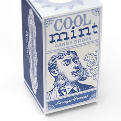
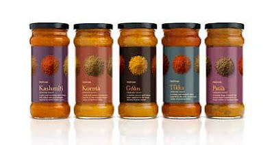
I'm looking more at the design work on these packages. I like there simplicity and how they communicate brilliantly using colour and selective imagery. I would like my own packaging to communicate as these do so brilliantly. Both also have a very vintage feel the sort I would like to nail.
Showing posts with label Looking at packaging.. Show all posts
Showing posts with label Looking at packaging.. Show all posts
Monday, 8 November 2010
Tuesday, 26 October 2010
Little Match Seller......
Sea Cider....
One thing comes to mind when I look at these packaging solutions fun. I love the vibrant colours for me they mirror what the products represent.
Glorious Soups....
Love this great word association, the word glorious really gives the product a special feel. I love how these packages work as a successful range. The use of colour for each individual soup is carefully considered and put together.
Monday, 25 October 2010
Missile.....
I love how the branding relates to the content the streams running from the missile represent the fizz. This word association I would like to reflect in my own packaging.
Doritos.....
I love this packaging a reminds me very much of the current brief with the content relating to the packaging in colour and shape.
Sunday, 24 October 2010
Tuesday, 19 October 2010
Thursday, 14 October 2010
Perfume Packaging......
I love this the product Is a well researched product that has a subtle connection with its audience that makes up some stunning packaging.
Packaging Range....
In this post I have gathered together various packaging this varies from a range of wines with different colours or image to a range that works together.
Preshfruit packages work as a series due to their shape, they almost need to come as a series to make sense. I need to adopt some similar thinking.
 |
A great range of simple packaging solutions great colours and Imagery. That work as a range. |
Wine bottles that work as a set!
Sausage that look a little like cigars.
This range works because the packaging looks healthy.
This packaging almost tastes as it looks. Very organic packaging an interesting use of type as image.
Some great packaging solutions from the 60's so simple and very appropriate for my wrap it up brief.
Waitrose packaging has a quality look and feel I guess that why everyone feel obliged to pay more. This is an example of a range of ranges I suppose.
Subscribe to:
Posts (Atom)


