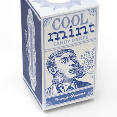
I feel the net for my mini boxes of sweets lacks a little imagination, however I found this rather interesting box design on a blog could be a runner with a little modification....
Showing posts with label Relevant packaging ranges.. Show all posts
Showing posts with label Relevant packaging ranges.. Show all posts
Monday, 22 November 2010
Monday, 8 November 2010
Relevant Packaging Artwork......
In this blog post I have collected a range of packaging that is not necessarily associated with sweets yet is relevant for different reasons. This is the artwork colours illustration style etc. This I hope will Inform my design decisions.
Above is a collection of old mustard containers i'm looking closely at pattern shape and colour.
Really interested in the use of colour and stock, like the classic look and branding is directly relevant to my own Idea.
This works so well with my practice a really interested with the colour and use of imagery...
This has no relevance to sweets I just love the simple black and white style against the brown paper. Perhaps this is all that is needed for my own packaging?
Similar to the last example I love the stock and simple colour use. The possibility of packaging sweets by using a simple paper sleeve is something I might look into.
Again simple and effective, the idea of packaging my packaging is something that might apply to sweets? Is this how my own personal range could be presented.
Hand rendered typography looks so natural I intend to use it at some point the above is such a good example, I personally hate vector lines!
The three examples above are fantastic in their composition iv'e been looking at a lot of this stuff to enable me to rough out my own ideas.
Packaging artwork...
I'm looking more at the design work on these packages. I like there simplicity and how they communicate brilliantly using colour and selective imagery. I would like my own packaging to communicate as these do so brilliantly. Both also have a very vintage feel the sort I would like to nail.
Range of Packaging.....
A great range of packaging beautifully presented great colours and illustration. Also the packaging solutions are very clever...
Other Cadbury's Gift sets....
As well as Roses cadbury have launched more sucessful ranges.....
Heroes: A wonderful assortment
Celebrations:
I beleve celebrations have the most interesting packaging range love the shape of the selection boxes.
For me the above is a great example of how colour and typography can be used to give a similar product a copletely different feel....
Love the shape of this package the above packaging means that celebrations are more assesible and functional.
Milk Tray:
Sophisticated and affordable...
Nestle Quality Street....
Really like the colours and the exciting range of choices.
This really shows the range of products and types of packaging that can be used.
More than the tin I love the shape.... Also the same feel can be achieved by using card....
Another box and a good example of how packaging can be manipulated love the triangle....
Thursday, 14 October 2010
Wednesday, 13 October 2010
Bakery...
I like this because image need not apply a bakery could have covered their packaging in pictures of small loafs and chefs hats, instead a great typographical solution.
Subscribe to:
Posts (Atom)


