Below
Flourpot is a take out I realy like the whole hand rendered aproach and its consistency throughout.
Below
Antico love the cluttered hand rendered type and the use of coloures stock interests me. I prefere a more minimal aproach with the use of negative space.
Below
Restaurant Julian, I love this because it demonstrates beutifull how branding can be delivered across a range. I also love the examples of scale how it goes from beer mats to inhouse graphics and window transferes.
Below
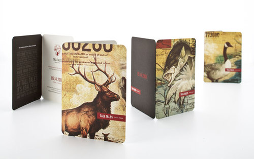
Tall tales a perfect example of a restaurant / take out, what I love is the theme linked with the location building etc. This theme gives the restaurant origionality a quirkness that I would love to apply within my own work, this could be established by the location people slang etc.
The illustrative style is also very endeering.


No comments:
Post a Comment